Showing posts with label professional studies. Show all posts

Thursday, 16 April 2015

Writing a commission

Commissions can range from a highly detailed file with pages of information about what the client wants to a small paragraph where there is lots of room for your your own artistic ideas to be incorporated.  it is important to have all of the information of what the client wants before starting work on a project. It is also important to keep referring back to it to remind yourself of what the client wants ensuring that you don't go off track.

Although a written commission is vital to you they can also have their hindrances for example:
  • They might want something that you don't think will work, then you will have to persuade the client that you are right (in a nice way.)
  • if you read over it too much and it could make you overthink the design resulting in a sloppy final piece.  
what do you need from it? there are a few vital things that you need to make sure you know when you have received a commission, such as:
  • The deadline.
  • How they want the work delivered.
  • The sizes.
  • What hey want you to create, in detail. 
Once you have read through the commission/brief there are a few steps that should be taken to ensure that the job runs smoothly and you get everything done on time. This will maintain your professionalism and make the employer have more confidence in you and will sway them towards hiring you again. these things are:
  • Plan out your time for every working day that you have until the deadline.
  • have a diary to plan everything out so you can refer back to what you should be doing. 
  • research the company and the subject of what they want you to create to make sure what you create is fitting. 
We were asked to write a mock commission to get us thinking about the amount of detail that is needed for a good commission. Here is the one that my group wrote. 

- A2 poster to advertise heavy rock music festival. 
- Must leave room for festival logo and acts names through centre to be added later.  
- Retro 60's-70's Horror/ B movie theme but must relate to music. 
-Limited colour palette (black and grey) limited use of other colours accepted (reds, yellows) think sin city. 
-Submitted as a jpeg, in CMYK, 3mm bleed, 300dpi. 
- Deadline 17/04/2015.


Wednesday, 15 April 2015

Professional delivery

When it comes to professional delivery there are lots of things that you need to know from your client before you send the work over. 

What do you need to know?

  • The size/s.
  • The format.
  • How they want it delivering to them e.g E-mail, dropbox, post.
  • Bleed sizes. 
  • Colours e.g RGB, CKMY.
  • Black and white or colour.
  • Deadline. 
  • File size.

there are other things that are important for you to do when delivering work to a client, reliability plays a huge part in your reputation as an illustrator. You have to be consistent with hitting your deadlines and with your art work, as if you are not you will look unprofessional and it will put the company off hiring you again. getting all of the delivery specifications correct first time plays a large part in looking  professional and reliable so make sure that you get this right. 

Whether it's through keeping to deadlines or ensuring the quality of your artwork, weaving reliability into your profile is essential for building and maintaining professional relationships. [1]

Communication is the main skill that will ensure that your professional delivery runs smoothly as you will have to keep in contact with your client to make sure you both know what is happening and you get it right first time. 

You  have to maintain good communication between yourself and your client so there are no mixed messages along the way. people will communicate to you in their own way for example, some clients might be more friendly and relaxed in their way of speaking and others may be more corporate and professional. As an illustrator you will have to adapt to their way of communicating and reply accordingly. It is important to read over what they have said a few times (or think it through if its a phone call) and take your time to reply to them.  


Each client will communicate with you in their own way. It's likely that the phone call or email offering you a commission may seem casual and informal and the dialogue friendly. Your aim as an illustrator is to respond appropriately whatever the approach and to develop an ongoing professional rapport with each client.[2]


Being confident and calm are also two very important parts when it comes to communication you have to sound like you are a professional that knows what you are talking about because then your employer will automatically have more confidence in you. 

Overall it is very important to constantly refresh your memory on all of the correct specifications for your professional delivery. If you are unsure about something or if you haven't received a piece of information good communication skills with your client are vital. All of these things should ensure that your professional delivery runs smoothly.  


[1] J DAVIES, D BRAZEL, Becoming a Successful Illustrator, p. 50
[2] J DAVIES, D BRAZEL, Becoming a Successful Illustrator, p. 50

Thursday, 12 February 2015

Communication and Commissions

Communication:

When working with a client on a commission it is vital to communicate clearly to each other otherwise there will be a lot of confusion and mixed messages. Often if a company is in experienced with working with illustrators there will be a lack of communication and the illustrator might do something that the company didn't exactly want because they didn't communicate clearly enough. Things like this should not happen with commissions because everyone involved has to be 100 percent clearly informed so everyone knows what is going on. For example your employer might want a full book done in 6 months but the illustrator might think that is too much for the time period but if this is not communicated back to the client then the work wont get done and you might not get paid so everything should be made clear from the beginning.


Commissions:


Commissions are very important for illustrators because this is generally how they will make most of their income if they are working free lance. A commission is when someone agrees to pay you to create something for them, they set the brief and all of the correct measurements and formats. It is basically a written down explanation of what the client wants.

Briefs:


This is the document that contains every detail of what the client wants from you. The brief should be read very carefully and constantly referred back to, to make sure you are doing everything that the client asked for. The brief should be clear and if anything on it is mis understood the client should be asked and the issue cleared up straight away.


Contracts:

Another thing that is very important when taking on a big brief is to get a contract written up so that you have a legal bond that can not be broken. this protects the illustrator against getting taken advantage of by companies. contracts should state the amount of work that should be done so the illustrator doesn't end up doing way more than they will get paid for. It also legally insures that you will get paid and if a payment is not made then you have written agreements to back you up. It often happens that an illustrator will do some work without a contract and not get paid at all, you always want to make sure that you can avoid this happening.


Payment :

when taking on a job it is good to ensure there is some kind of payment or deposit before the job actually begins just to ensure that you will receive some sort of money for the work begins. This is because clients often try to get away without paying the full price or the company you are working for could go bankrupt before the project is finished leaving the illustrator with no payment at all.


Thursday, 13 November 2014

Master of the trade- Oliver Jeffers

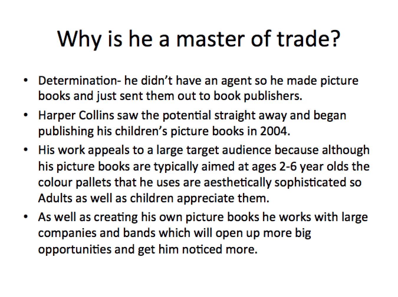
I decided to write about Oliver Jeffers as my master of the trade because I know a lot of information about him already and he is very successful in his career. Here is the powerpoint presentation that I created.


   I was chosen by my group for the best presentation because it was concise, had a beginning middle and end, and flowed well. I feel as though if I was to choose a presentation that I liked most it would be May's because she talked about the artist that she thinks is a master of their trade and she also gave some  historical background to the techniques that that artist uses. I feel although this gave a really good historical background to the artists inspirations and techniques. It also had really nice images that that artist had created on it.

Wednesday, 8 October 2014

Halloween Party update

This week the party planning preparations have progressed massively as a lot of things have been sorted out and put into motion.

  • The posters have been designed and printed.
  • Tickets have been designed and are ready to be printed for next week when we start selling them. 
  • A rota has been made for ticket sales so everyone knows what days they will be selling tickets on.
  • A table has been confirmed for us to sit at in reception to sell the tickets
  • Skyy have confirmed that we can partner with them and do a deal on tickets.  
  • The venue manager has confirmed information about the venue, bar and bar staff. 
So far the party planning is looking pretty good and at the moment it seems like we will be able to host a great halloween party and have everything done in good time for everything to run smoothly. There are still a few things that need to be sorted for example music and decorations but they are in the process of planning. These two aspects are not things that needed to be planned as urgently as the others because these things happen on the night of the event not before.

Defining markets and understanding consumers


  • A Consumer is a specific group of people that buy a product. To know your consumer there are a lot of different things that have to be thought about. Consumers are constantly changing and evolving with the times as trends, environment and their age changes. There are a few exceptions to this though for example if you illustrate for children's books then your consumer age never really changes. Many things can be done to help you understand the consumer more, for example you could interact with your consumer through the use of social media platforms such as blogs, facebook pages, youtube, instagram and other similar platforms. Another way of collecting your consumers opinions and feedback is through surveys, this is a good way of contacting a lot of people and getting a fast response in a small amount of time.  

'Once the consumer journey is defined, the channel strategy is aligned to each phase of the targeted response path including: payed media, owned media, (properties owned by a brand [e.g. website, facebook page, videos and physical events]), and earned media (volume and sentiment of social media discussions). The owned and earned media channels are mission-critical for non profits as they provide a lower cost option to reach consumers and have them interact with the cause.' [1]


  • There are 3 main points that you need to think about and know the answers to in order to understand your consumer. they are: 
  1. Who? Who will be buying your products for example, if you create childrens books then your target audience is children but your consumer will be the parents as they are the ones to buy the books. So your product has to appeal to the parents as much as the child. 
  2. Why? Why will your consumer be buying your product, for decoration? education? as a gift? This is important to think about because you can taylor the aesthetic and pricing to the purpose of the product
  3. When? When will the consumer be buying the product, what will be the peak times that your product will sell, Holidays? birthdays? You need to know this information to know when to bring out new products. 
  • As well as these points there are other things to consider for example how do you want your image to come across?, how should you approach your consumer?, is your market captured or not?.
  • You have to sell yourself as well as your product because the consumer will feel as if they are buying into a more personal experience with the company. Its all about giving your consumers a good experience when buying from you.  


  • A market is where your products fit in within the industry, this is defined by your consumer. Within the market you always have to consider the future of it as your consumer may change throughout the years. Your market is defined by the consumer feedback, if you go onto the market without knowing your consumer then you wont really be aiming your work at anyone in particular causing your product to not sell.  After getting to know your consumer you will know how to define your market to suit them. 


I decided to do some primary research into a company and their consumer and how they go about targeting their consumer. I decided to look into Coca Cola as they are one of the most widely known brands throughout the world. 
  • I found straight away that they have a Customer care survey to connect with the consumer and get feedback on their product.
  • Their website has a community section allowing consumers to feel as though they are part of a larger community, as if the product is connecting them to people all around the world that share a liking for the same product.  
  • Coka cola target a captured market by getting involved with events such as the Olympic games.
  • They build relationships with consumers by executing well thought out marketing campaigns, promotions and merchandising.[2]  
  • For the last 2 summers in the UK Coca cola have had a huge marketing campaign called 'share a coke' where the companies logo has been replaced with popular names. The company knew that this would result in more sales because they know their consumer well. 
About the 'Share a Coke' campaign- 'The company said there have been more than 125,000 posts about the campaign across all channels from June 2 through July 14 and said 96% of consumer sentiment toward the campaign is either positive or neutral.' [3]


[1] Marketing for goods, Markets for Good Selected Readings: Making Sense of Data and Information in the social sector, Published january 2014. 
[2] http://www.coca-colahellenic.com/aboutus/customers, marketing and merchandising  (accessed 08/10/14) 
[3] Tadena.N, The wall street journal online, Coke’s Personalized Marketing Campaign Gains Online Buzz (accessed  08/10/14)

Monday, 29 September 2014

Level 5 Professional studies introduction

Within professional studies this year we will be learning about and expanding our knowledge of the illustration industry and where we fit into this fast paced industry. We will learn more about things such as networking, markets, working with clients and other similar topics.

The main aim of this module is to help us know the industry inside out so that we are prepared for the real working world when we leave university. We will research all areas of the industry then choose an area that we would like to focus on in more detail and in the end produce academic evidence of our findings. This module should help us realise where we fit into the industry and be able to correctly identify our target market.

I enjoyed professional studies last year and look forward to taking my studies in this subject further in level 5.

Thursday, 17 April 2014

Questionnaire response from Quatro Publishing Group UK

Quatro Publishing group were also very kind and answered the questions that i asked. They had different views to Candlewick press on the topic of trends. It was great to see companies with opposing views so i could compare them within my report.  

1.       Do Illustrations in children's books respond to changing trends in colours and styles?

Not really. I would say the illustration styles we choose for our books are quite traditional, and timeless as we hope the books will sell for many years to come, and not become old fashioned looking.

2.       If so how long does it take for the changes in trend to influence illustration?

3.       Do trends influence your choice of illustrator?

We have series styles to follow. The choice of illustrator is made on what would best suit the project.

4.       Are Illustrators given remits that reflect current trends?
No

Kind regards
Laura

Questionnaire response from candlewick press

Jessica from Candlewick press answered the questions in my Questionnaire and she was beyond helpful she gave me a lot of information and starting points for more research. I am so grateful for her help, she made my report a lot easier. Here are her answers to my questions: 

Hi Melissa, 

I'm Jessica, the Art Coordination Associate at Candlewick Press. I'm responsible for scouting new illustration talent, maintaining a database of artists who might be right for illustration work on Candlewick projects, and matching illustrators with manuscripts (among other things!). I'd be happy to help you with your project. 

Do Illustrations in children's books respond to changing trends in colours and styles?
Yes, I think they certainly do. I think, in general, palettes are becoming brighter and more saturated, and with more white space integrated into the illustration. There is also a kind of counter-movement to this with muted colors that are very fresh and contemporary but done in a sort of retro style.  
     And there are certainly trends in styles too. Of course, digital coloring/drawing (i.e. in Photoshop) is a huge difference between contemporary illustration and that of 10–15ish years ago. I am personally not a big fan of the flat, digitally colored look, so I'm glad to see a swing back towards more textured illustrations now—both with traditional mediums like watercolor and acrylic, and digital art that looks more like traditional media. I think a lot of illustration artists are combining traditional and digital media too—creating physical paintings/drawings and scanning them to either tweak the work or digitally color the sketches. A few of my favorite artists also work in digital collage, where they paint lots of patterns and then scan them into their computer, creating collages without physically cutting and pasting anything. 
    When I think of art from 20ish years ago, I think mainly of a warm, slightly murky palette that's somewhere in between bright and muted, and realistic paintings. Now, I think illustrations are becoming much looser, less realistic, and incorporating more mediums into each illustration (so not just 100% watercolor or 100% acrylic, etc.). Though of course there are certainly a huge amount of exceptions here. 
    Looking at the Caldecott winners and Honorees (and, in the UK, the Kate Greenaway winners) over the years is a great way to see the trends, I think. For example: 
  • 1993 winner – traditional watercolor; palette is definitely a bit murky; and characters are pretty realistic 
  • 1994 winner – traditional watercolor; highly realistic style. (Note palette quite bright here—many, many exceptions to the generalizations!) 
  • 2013 winner – mix of traditional and digital media; style is graphic, subtle, simplistic; palette is muted but still rather saturated with all the deep black—this is the kind of retro-muted style I was mentioning.
  • 2014 winner – kind of harkens back to the older picture book look, but note that the human characters are much less detailed (especially their faces), and there is a lot more variation in the typography and page layout than in 1994's Grandfather's Journey; this is, I think, a very successful modern take on the old picture book style. 

If so how long does it take for the changes in trend to influence illustration?
This varies of course but I think not very long. There are thousands of new picture books published every year, and illustrators and publishers are always looking for styles that look different and will thus stand apart from the rest. I think because of this crowded marketplace, the boundaries are always being pushed to keep illustrations looking fresh and unique. 

Do trends influence your choice of illustrator?
Yes, we will certainly discuss what style of illustration will best complement a text. For example, if a text is very contemporary, we will often look for a similarly contemporary-looking artist, which of course changes according to present trends. We also sometimes pare more traditional texts with contemporary illustrations as a strategic way to set the book apart in its corner of the marketplace, or to highlight its contemporary attributes (i.e. a modern retelling of a classic fairytale). 

Are Illustrators given remits that reflect current trends?
I'm not quite sure what you mean by this question! Happy to answer if you want to clarify what you mean by "remit" for me. Maybe this is a US/UK usage thing :-) 
     If you mean something like art direction(??) then yes and no—yes in the sense that art directors and designers will always gently push illustrators to give their best work and to evolve their style slightly with every new book. But no in the sense of pushing an artist to do something that isn't true to his/her personal artistic style… or at least a good art director wouldn't do that, though I'm sure it happens sometimes! 


Wednesday, 16 April 2014

Copyright

The dictionary definition of Copyright is: the exclusive and assignable legal right, given to the originator for a fixed number of years, to print, publish, perform, film, or record literary, artistic, or musical material.[1]
In basic terms If you have created something then you legally own it and no one else can claim that it is thier's. You are also protected if anyone claims that they created something that you did. The only thing with copyright is that there is a lot of loop holes and flaws within it. For instence you cannot copyright protect an idea as an idea is not a physical thing. If you action the idea and create what you were thinking of then that can be copyrighted and protected. Almost anything that has been created can be copyrighted for example a drawing, poem, photograph. The use of the internet has made it more important to copyright your work now because someone could see a piece of your work online and decide to take the image of your work and claim it as thier own. If you have copyrighted it then you own all of the rights to that work.


 There is a few things you can do to protect yourself with copyright for example you could use the copyright symbol with your name next to it on the bottom of your work. You could also post yourself a physical copy of your work within a sealed stamped envelope as this will pass through the mail system and have official date stamps, Although this is not the best way to copyright it still provides a bit of evidence if anything gets took to court. The best way to copyright a piece of work is probably to talk to a copyright lawyer that can help you to choose the best option on how to copyright your work. 
Copyright also does run out after a certain amount of years so its good to renew it after 50 plus years. 


[1] Oxford Dictionary Definition, http://www.oxforddictionaries.com/definition/english/copyright (accessed 16/04/2014)

Saturday, 22 February 2014

Whats happening now

There is always lots of different things going on that you can go and see. As in any creative industry it is good to keep up to date with whats going on in the world of design. This involves going to different  exhibitions and events to see what is current and what is working within the industry.


Here are a few events and links to web pages that i have found that are happening around England in the coming months:


Richard Hamilton was a pioneer of the pop art genre and one of the most influential artists of the last century. His work is being showcased at the Tate Modern from Thursday 13th February until Monday 26th may http://www.tate.org.uk/whats-on/tate-modern/exhibition/richard-hamilton


Dick Bruna is most well known for creating the much loved children's book character Miffy. as it is coming up to his 60th anniversary since the first publication of 'The apple' the Foyles book shop is hosting an exhibition showing Dick Bruna's work on tuesday 6th August 2013  http://www.foyles.co.uk/Dick-Bruna-Exhibition


Here are a few examples of galleries that are really well known especially for exhibiting illustrations

Illustrative festival Berlin

This festival is a bi annual festival celebrating and showing art and illustration from all around the world.  This festival is not set in stone to be held at a specific time of the year and some years it is not ran at all so with things like this you have to keep up to date with what is going on and where you can exhibit your work. Festivals are great for showing your work to lost of people in a small amount of time. This festival is also particularly good for young illustrators as every year they have a young illustrators award.
Find their website here


House of Illustration

This company is great for illustrators in particular as they curate touring exhibitions, run international competitions and put on events with some of the worlds leading illustrators. They are also working towards opening up their own public gallery and education space especially for illustration. 
Find their website here


The illustration cupboard 

This is a great place for illustrators to showcase their work as this gallery is well known throughout the illustration industry. The illustration cupboard is a central London gallery that shows some of the best contemporary illustrations from around the world. This gallery is mainly focussed on children's books.
Find their website Here


keeping up with trends

Keeping track of trends is probably one of the most important parts of working in the creative industry as it keeps you ahead of the game and enables you to create and sell what people will like. It could also really help with getting inspired. it sounds strange that creative styles that are used change with the current trends but they really do so its a really important thing to consider.

There are many different ways of keeping up with current trends. Things such as:

  • Buying the latest magazines.
  • following companies on social media sites such as twitter, Instagram, youtube and Facebook.
  • Looking at the trending topics on social media sites.
  • Going to events such as art exhibitions, design shows, art conventions, fashion shows ect.
  • going to big shops and looking at the displays.
  • taking notice of changing trends within your local high street.
  • taking notice of what shops are selling. 
Even just looking at the world around you and taking notice of what is going on can help with keeping up with trends. It is a really easy thing to do. Knowing what is going on keeps you one step ahead in the design world as the way that trends develop and evolve is with slow but sure nudges and changes. so if you think about what is in now and adapt it a bit it can help to predict what will be in within the next few months. 


Trend forecasting is another great way to check and be sure on whats on trend as they are the people that set and notice the trends that are in. There is trend forecasting for all different things, almost everything you could imagine, for example things such as fashion, colour, interior design ect. All of these companies have websites that are very clear on showing whats in and how the latest trends are developing here are a few of the companies and their websites that are really good for this:


Lots of different things effect how trends are influenced and change and all areas of design complement each other for example whats on trend in terms of interior design or colour will reference whats on trend in fashion or illustration. For example i looked on Trendstop and i noticed that in the trend briefings for spring/summer 2015 Pantone's colour of the year (Radiant Orchid) was referenced a lot. Here are some images to back up my findings. 


In this Trend briefing mood board for Spring/Summer 2015, the hat to the left and the petal jumper in the centre use pantone's colour of the year. 

Tuesday, 18 February 2014

Exhibitions

Galleries are a prefect platform for self promotion and selling your work. They are also great to see what people seem to like most about your work, this in return will help you to develop and refine creatively.

There is different types of exhibitions to suit everyone's target audience and style. To hold an exhibition or have your work on display it should be well thought through and considered before going ahead and showcasing your work. There are a few things in particular that should be considered:

  • Your target audience, are you showing your work in the correct setting where your target audience will see it?
  • Layout, will how you've displayed your work be visually pleasing and intrigue viewers
  • Price, if you are selling your work think about and consider who will be wanting to buy it e.g business men  and women or young students. Does your price fit with the target audience.
  • does your work represent your target audience well.  

Here are a few examples of exhibitions that i really like and think work well. I decided to focus on looking at the layouts and overall look rather than the art itself.

William J. O'Brien, 'The Lovers', Installation view, Almine Rech Gallery, Paris. © William J. O'Brien. Photo 

I really like the installation above because i think the bright patterns stand out really well against the white walls. I think it brings out the paintings in a really nice way. I also like how they are placed a bit mis mashed it is a nice change to the average perfectly placed gallery picture. This kind of exhibition would be good for all types of different people as it looks fun but at the same time professional.


Chicken Leg Window on the Moran Street Installation
I really love how the artwork above is displayed it is so unique and the colours work so well together. I really love the fact that the artist has utilised an old house to show art work in a creative way. This approach wouldn't really work for commercial sale unless it was done on the side of a building to promote people to come to an exhibition you might be holding. 


  I love the simplicity of the way the space within the above exhibition has been used. the layout and frames compliment the work beautifully and the monochrome colour scheme works perfectly within the art work. I think the natural wood frames bring the whole thing together. this exhibition would work well within a small gallery with a target audience of the every day person or art student i would say. I think the setting doesn't look high end enough to be targeted at more wealthy people. 

After looking at a few different exhibitions that i like i have discovered that i like exhibitions that have a bit more of a unique quirky look to them. I prefer a more junk shop look to a clean sterile looking gallery with everything placed perfectly in the centre of a wall. 

creative CV

A creative CV is different to a usual CV that you might use to get a job. it is quite similar in the fact that it documents previous things that you have done, but instead of documenting previous jobs it documents previous companies/ artists that you have worked for. It can also look more visually attractive than a normal CV as it is acceptable to personalise it with some of your creative work. The layout can also be different and un formatted compared to a traditional Cv

As i will need to create my own creative cv in the future, i have done some research into some creative cv's that i like and why i like them. I have also included a few bad creative cv's and my opinion on why i think they're bad.


The image above is a creative CV that i really like. I love how simplistic and neat it looks but at the same time it looks interesting. I really like how the artist has shown their different skills and the level of them in a pie chart format i think thats really clever. Another little detail that i think works really well is how the artist has shown the different locations that they have worked by using the little pin point logo from google maps. I also think that the timeline at the bottom is a really strong feature within this CV


I love the layout of the CV above everything is laid out and designed really nicely it all works really well together. I also like the simple monochrome colour scheme It fits in really well with the style and design of the drawings and fonts that are used within the CV.


The creative CV above is very different to the two previous ones but i love it so much. I think it is such a unique way of showing your design skills and delivering a business card in a chocolate bar format.I haven't seen anything like this before and it would definitely leave a lasting impression on any potential employer.


I don't like the CV above i think the layout is really poor and it looks hard to read with the angles of the text. I think if i received this CV i wouldn't want to read it it looks too complicates and it would take too much effort.